Responsive Design
(Revised August 15, 2021)
You won’t see many kitchen appliances in Harvest Gold and Avocado Green today. Those colors were popular in the late 60s, and into the 70s and 80s, long before many of us here were born. Other colors like Coppertone came and went and today look very dated, while white appliances have survived. In another 10 or 20 years we’ll probably be asking ourselves what we were thinking when we remodeled with stainless steel appliances.
Websites have had similar fashion changes. In the early days of the web, and by that I mean pre-1995, the only web interfaces were text based, and most of us didn’t know what the Internet was. Eventually graphical interfaces came along, with the ability to align images and text in tables. That was a huge step forward.
Other technology appeared and by the end of the 90s we were seeing Flash animation, which was very “cool” then. If you have an older website that still uses Flash, though, many people are not seeing your animation today because not all devices support it. Your animated website may look completely empty to visitors, and therefore be completely ineffective.
Websites were relatively narrow in the 1990s, either 640 pixels wide or eventually 800 pixels wide, because most people had monitors that could only support those sizes. By 2011 almost all those monitors were gone, and so were the narrow websites–I hope yours is not that narrow! From about 2001 to 2007 medium websites of about 1024 pixels in width were common, but starting around 2007 most monitors and therefore most websites were 1200 pixels wide. Today many people have monitors that are 1920 pixels wide, and so the width of websites has increased again. There are always going to be people with smaller monitors than the norm for a given year, and people with larger monitors, but a good rule is to design for the size that most people have. So, if you have a website that’s more than 5 years old, it probably looks a little narrow and dated today, even if the design is otherwise good.
All that web page growth was fine until a few years ago when something interesting started happening. iPads and other tablets came out and people started surfing on the Internet. Worse, Smartphones came along and now people started looking at websites on very tiny screens. So how did this work?
If you had a traditional website, it would appear on a phone, but exceptionally small. Well, the user can always pinch out to see your site, right?
In the early days pinching out was just fine, although if you pinch out on a phone to enlarge a web page, you can no longer see the entire page at one time. The original large design is intact, but the user is only seeing a small part of it. In fact, he or she probably has to enlarge it just to poke the screen with a thumb to activate a menu or button. That was OK for a couple years until web developers figured out something called “responsive design”, and more importantly, how to make it work within tool sets.
One early trick was simply to detect whether someone was on a mobile device, and if so, to send them to an entirely different website of yours, one formatted with small screens in mind. So your big beautiful website with the nice sidebars and complicated menus, would be dumbed-down for the phone; the sidebars would be removed, the menus simplified, perhaps even pages removed. But the problem with this approach was that your developers had to create two websites for you, not just one, and that meant almost twice as much work and therefore twice as much expense.
In 2017, more than half of all visitors to websites use tablets or phones, so we really can’t ignore those devices!
Today our tools work for the following four widths, and really, any size at all. But these are the devices most likely to be used to display your website:
- Phone (up to 767 pixels wide)
- Tablet (768 to 1024 pixels)
- Small computer (1025 to 1279 pixels)
- Large computer (1280 pixels or more)
Notice what happens to the screen design on four different devices in the following photo.
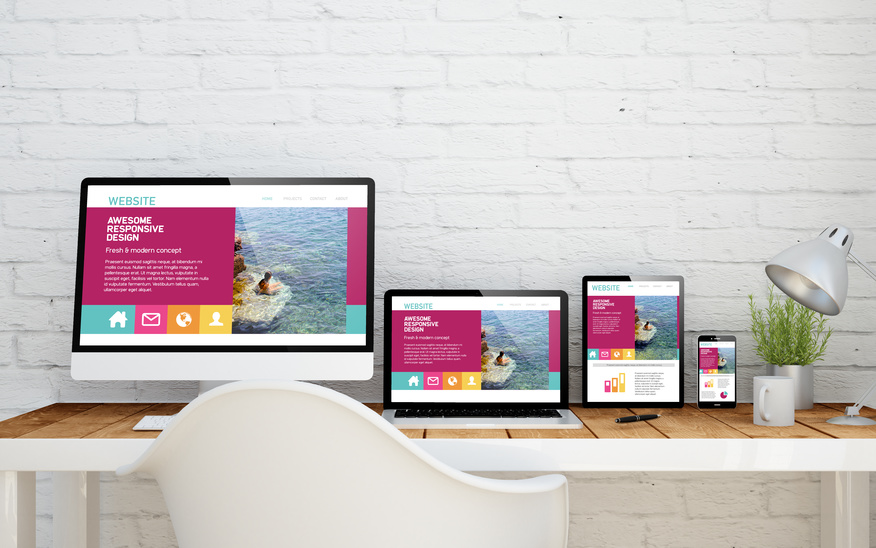
The image in the photo for this website was forced to keep the same proportions. That’s unusual today; in most cases an image is increasingly cropped as you reduce the screen size. We’ll see that below. Typically when the screen is too small for the width of the menu, the menu collapses to the “burger icon”, those three horizontal lines that you can click on to open the menu again, usually in a vertical list. Other icons may get moved around as needed. The following is an example of how the image generally is cropped horizontally on different width devices. Notice how on the large desktop monitor the jetty starts out very wide with the vertical structure in the center of the photo.
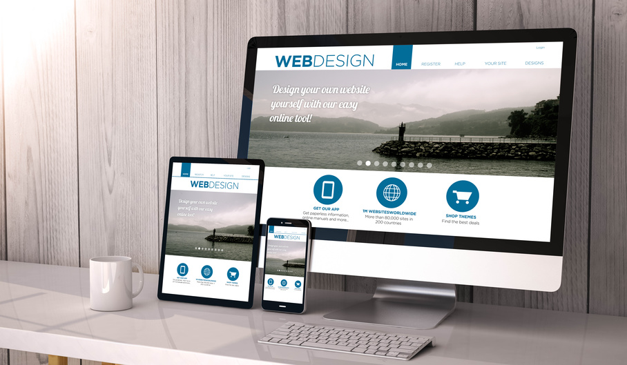
On the tablet the vertical structure is still in the middle of the image, but now part of the water on the left has been removed, and part of the jetty on the right is gone. When you get down to the phone width, a lot more of the image is gone. The image still looks good, but it’s cropped horizontally.
Another interesting thing is what happens to the text on that photo. In this case the designer chose to place the text above and to the left of the vertical structure, but you’ll notice how it gets much closer as the screen size shrinks. That means the text may eventually cover a key part of the image, so that’s why it’s necessary to check your page on different devices.
Notice also how the fonts and icons on the computer screen seem huge, but as the web page is reduced they become smaller. Most people today recognize oversize fonts and icons on a computer screen as a telltale sign that the web design is responsive and was designed to be readable when reduced to fit on a small device. We’ll note that it’s possible for us to force the fonts to different sizes depending on the device size, but we try to do very little of this because it’s time consuming and therefore expensive. Usually the oversize font approach is well accepted by visitors to your site, and is efficient to develop.
Here are some examples of a page from this Blue Crab website displayed on 4 different size devices. Note how the images and text shift around. Here’s what it looks like on a wide computer (reduced to fit in this article):

Here’s what it looks like on a smaller computer like a laptop, or a tablet in landscape mode:
 Here’s what it looks like on a tablet in portrait mode:

And finally, here’s what it looks like on a phone:

The image is actually larger on the smaller phone because it now spans the entire width, but only one icon fits on each line.
One thing to keep in mind with responsive design is that your pages are going to shift according to the size of the device, so you may find that you don’t like the way a line of text breaks on, say, a tablet, but it’s OK on the phone and on a large computer. If we adjust the text for the tablet, it will probably “break” it for the other devices. Thus, unless you have an extremely large budget, plan on living with your pages looking good on all size devices, but perhaps not being perfect.
Think of it like the shift we all had to make when we moved from designs that were printed, to web designs. You can get your print design exactly the way you want it because it will be printed at only one size, the exact size you designed it. But web pages look somewhat different on different browsers and different size computer screens; the fonts may be slightly different, the page sizes may be somewhat different because the slightly different text breaks in different places, and so forth. We all had to relax our standards a bit when working with browsers instead of print, or go crazy. The same is true for designs viewed on different size devices today. You need a little flexibility. The alternative, to have a non-responsive design that remains fixed, is not a good choice today.
Another thing we don’t do today is use left sidebars. Why? Because that sidebar, which may contain the less important information, will be displayed first on a small device, followed by the column with your main text. It’s also not where we want our menu today, since the menu should collapse on small devices and is more appropriately displayed horizontally on wide devices and vertically on small devices when opened from the burger icon. Note that our ENS product has a left-hand menu, but we have special software on our responsive version that collapses the menu and avoids these problems.
There are many other considerations when the design will change across devices, but those are the design items we get the most questions about.
One final note. Responsive design is very important in Search Engine Optimization (SEO), the ability of your website page to rank in Google and other search engines. Google recently made a change to penalize websites that don’t resize for different devices! If you have an older website, you should consider updating it as soon as possible.
Thus, for a variety of reasons, you need to plan your next website makeover. If you can’t do it now, you should put it on your calendar for a month or two months from now so you make time to work with us to create an up-to-date, responsive design. A small, non-responsive website today is the equivalent of wearing a large collared paisley shirt and bell bottoms–they were great in their day, but not the image you want in 2021 and beyond!


